|
|||||||
|
|
San Francisco Bay Area Time-Scale Transit Map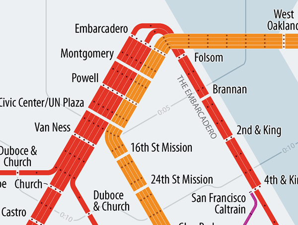

Files (last update 2014)
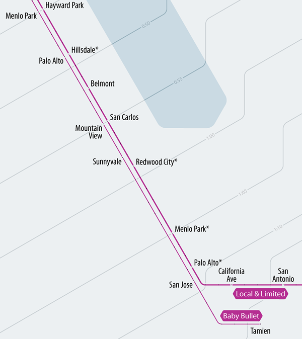
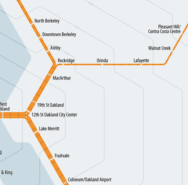
 This work by Peter Dunn is licensed under a Creative Commons Attribution-ShareAlike 4.0 International License. Mapping MinutesThis map of transit in the San Francisco Bay Area isn't really a map at all. Instead of reflecting the geographic locations of the BART, Muni Metro, and Caltrain systems like a map would, this diagram spaces stations according to the time it takes to travel between them. Places that are farther away on the map will take longer to get to, and closer places are quicker trips. Heading to a neighborhood for the first time? Scouting out someplace to move to? With a quick glance, you can get a sense of how “far” a destination is in terms that are often more important than miles on the ground—minutes of your time.
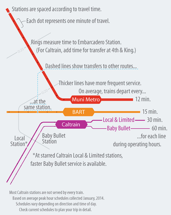
Subway maps are perfect for the time-scale treatment. For one thing, they are rarely drawn to scale in the first place, so viewers are used to some degree of geographic distortion. And unlike cars in rush hour traffic or people walking at their own pace, trains travel at fairly consistent and predictable speeds. The map is still based on several assumptions and averages that won't always reflect reality, so you'll want to check a current schedule to plan your trip in detail. 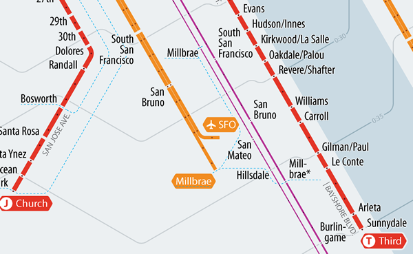
A New View of the CityThis perspective highlights a few points that are less apparent in other maps. For example, the miracle of the Transbay Tube makes downtown San Francisco closer to the East Bay than to many neighborhoods in the city itself. It's quicker to get from the Embarcadero to Bay Fair (22 miles) or Lafeyette (19 miles) than to Sunset Boulevard at Judah Street (less than 7 miles). In town, Taraval Street is about a mile farther from downtown than Judah Street, but Muni Metro gets there faster thanks to the Twin Peaks tunnel. On the Peninsula, the commuter rail has the effect of bringing the suburbs much closer to the city. Getting to Redwood City on Caltrain takes only a little longer than riding to the San Francisco city limits on the T - Third, less than one quarter the distance.
That doesn't mean that faster is better. Like many urban transit systems, Muni is often ridiculed for having such a slow average speed. One point this map makes, though, is that you can't tell the whole story in miles per hour. The speed of a city bus is slower than a commuter coach, but there's just a lot more city in one mile of San Francisco street than there is in a mile of freeway in the suburbs. What's more important than speed is the amount of stuff—jobs, shops, friends, parks, restaurants, whatever—a rider can get to in, say, 30 minutes. Whether you get there going 60 miles per hour or 8 shouldn't make much difference. By taking distance out of the picture, this map puts a new emphasis on time as the metric of comparison. 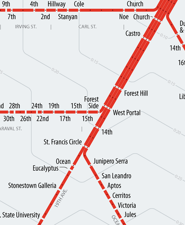
Why isn't this the official map?For a few good reasons. Schedules can change, and may even vary widely at different times of the day. Strong geographic references are usually an important aid to comprehending transit diagrams, and this map's distortions would be too confusing for riders trying to place themselves. More generally, every design decision in a good transit map is guided by the need to be as clear as possible. One thing that priority usually leads to is spreading out the busy city center and compressing the sparse peripheral areas in the suburbs so that the map reads evenly. When using a fixed time scale, the lines don't have that flexibility. Some areas remain too cluttered, requiring a smaller font size and potentially confusing conflicts. Other areas are quite thin. More than half of the area of the map is empty—not a good use of space when you're trying to catch a glimpse of the map in a crowded station. It's very difficult for a design to successfully serve two goals simultaneously, and the primary goal of this map is to show travel times, not to orient riders on a train to their stop.
Design NotesMy previous time-scale maps showing the Washington Metro, Boston's T, and Boston's commuter rail were heavily influenced by the official maps: each took a familiar design and re-shaped it to show new information. The Bay Area map takes a fresh approach. Since there's no official map showing the BART, Muni Metro, and Caltrain systems together, it's easier to start from scratch. A few things to point out in the design:
FeedbackI'm still fine tuning the map, and I'd love your feedback. If you think something could be made more clear, or maybe there's a local name the map got wrong, or if you just spot a typo, let me know: [email protected].
|
||||||
|
|
|||||||

