|
|||||||
|
|
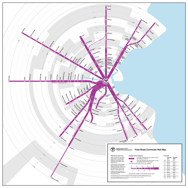
Time-Scale Map of MBTA Commuter RailThe Massachusetts Bay Transportation Authority's 134 commuter rail stations on 12 lines, spaced by average travel times to or from Boston North or South Station during peak schedules.
(Click to enlarge)
 This work by Peter Dunn is licensed under a Creative Commons Attribution-ShareAlike 4.0 International License. After making a time-scale map of the MBTA's four subway lines, I quickly realized how useful a similar diagram would be for the commuter rail. These diagrams work best with a strong center to serve as a common origin for measuring time. Boston's subway has four central transfer stations that do the job, but for many riders, those aren't the relevant focus. The commuter rail, on the other hand, has its two terminal stations that make a more appropriate center: every line terminates at either North or South station, and a huge percentage of riders begin or end their journey there. As a bonus, the commuter rail has actual schedules it aspires to keep, unlike the best-guess schedules of the T's subway trip planner. Plotting out these schedules gives a nice picture of commuters' travel times at a glance.
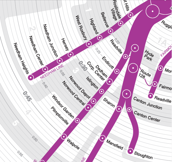
Since commuters probably already know their schedules, the diagram is potentially more useful to new riders. Car commuters can see where they might save time by taking the train. Newcomers looking for a place to move in the region can quickly compare how much of their day they'd spend commuting from various stations. (If you choose the home another six minutes away, that's an extra hour a week you'll spend getting to and from work.) Unlike the time-scale subway map, the rail diagram also adds a useful piece of information beyond travel times--service frequency. While on the subway you can show up at any station and expect not to wait too long for the next train, service at the commuter rail stations varies quite a bit. Just because you live close to a station doesn't mean you live close to convenient service. This diagram uses the size of the station markers to show the total number of trains per weekday serving that station. The thickness of the line represents the number of trains on the line. For example, the view below makes clear that the Lowell line (right) has more frequent service than the Fitchburg line (left), and that departures from Silver Hill are much less frequent than those from Lincoln.
Even though time-scale maps are perfectly useful for many travel situations, they wouldn't serve well as official system diagrams. For one thing, stretching out lines by travel time leaves a lot of empty space in between them, not an efficient design. Radial maps like this also forsake many of the geographic cues that help orient riders as directions are skewed and landmarks omitted. This map doesn't even show connections to the subway or other modes, which is a must for any good transit diagram. Even besides these drawbacks, showing scheduled travel time ultimately just isn't the most important job for a transit map to do.
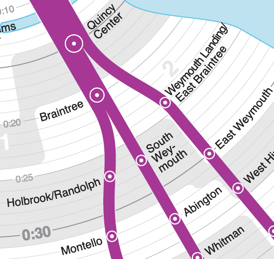
That said, the official MBTA commuter rail map could use some work, and this time-scale map does include three elements that the official map doesn't, but really should. First, it clearly shows the routing of train service, as opposed to the routing of train tracks. This is mostly a problem around the Readville junction, where the official map gives no indication of which lines connect to which other lines. Second, my map shows the names of the lines, which are sometimes but not always named after the terminal station. Lastly, it shows fare zones, which are omitted from the official map and are unnecessarily difficult to find at stations. As seen on Fast Company, We Love Beantown, Universal Hub, BostInno, Curbed Boston, and Transit Maps. |
||||||
|
|
|||||||


